Responsive layout
What is a responsive layout?Which elements play a role in responsive layouts?
How are responsive pages configured?
General settings of grids
Container settings
FAQ
What is a responsive layout?
A responsive page enables you to present content so that the presentation adjusts to the size of the browser window. The layout, design and visibility of each element can be controlled individually. This means it's easy to present a page's contents for various display sizes in a user-friendly manner. Intrexx allows you to define the layout rules for the following three display sizes:- SMALL (e.g. smartphones)
- MEDIUM (e.g. tablets)
- LARGE (e.g. desktop PCs)
 |
According to the mobile first principle, a responsive page should be conceptualized for the smallest display device first. The layout rules defined for the smallest display size are automatically applied to the larger display sizes. The rules are therefore inherited from Small to Large, provided these haven't been overwritten deliberately. |
Pages that have been conceptualized for smaller display sizes can also be used for larger devices. However, because more space is available there, you can take advantage of the responsive layout with this space and display more content. Furthermore, elements can be rearranged for this increased space.

Which elements play a role in responsive layouts?
The Grid element can be found in the Applications module. It can be implemented to give application pages a responsive layout. Its counterpart, Grid, which can be used for designing portal pages, can be found in the Design module. The foundational element for a responsive page is always one grid with 12 adjoined units. Containers are arranged in the grid. In terms of size, a container can take up 1-12 units in a grid and is always implemented as a div element. |
With a div element, multiple elements, such as text, graphics or tables, can be boxed together in one area. The div element invariably begins in a new row of the running text. In this way, areas can be created that can be formatted with the help of CSS. |
The grid element can be interleaved as often as needed and thus provides a variety of design options. Grids and containers can also be used on a page together with non-responsive elements. At least one container needs to be used in a grid, but there is no upper limit. The grid attempts to position the containers one after another in the row. Once the twelfth unit has been exceeded, the affected container is moved to a new row starting at grid unit 1.
How are responsive pages configured?
To design a responsive application page, position the grid, from the Elements area onto the workspace via drag & drop.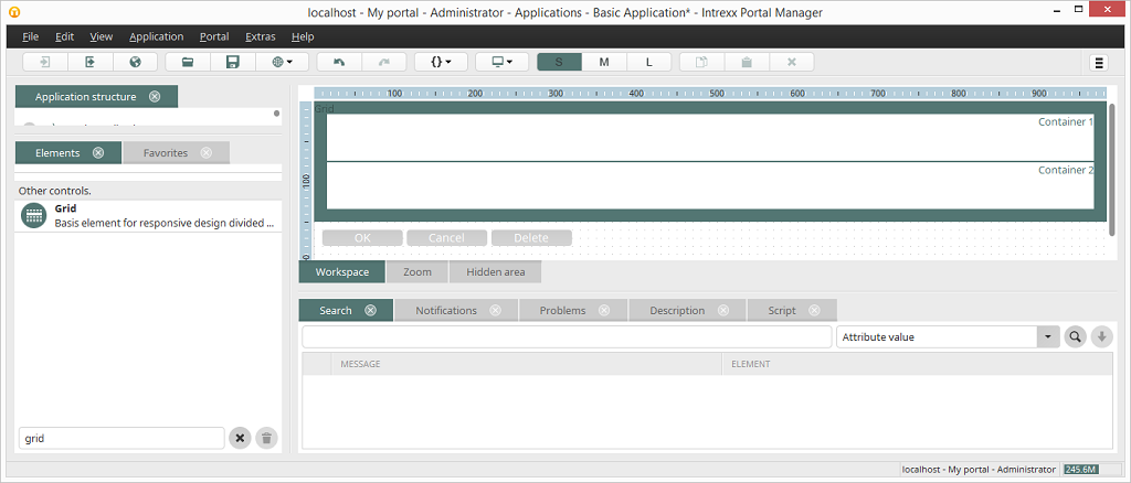
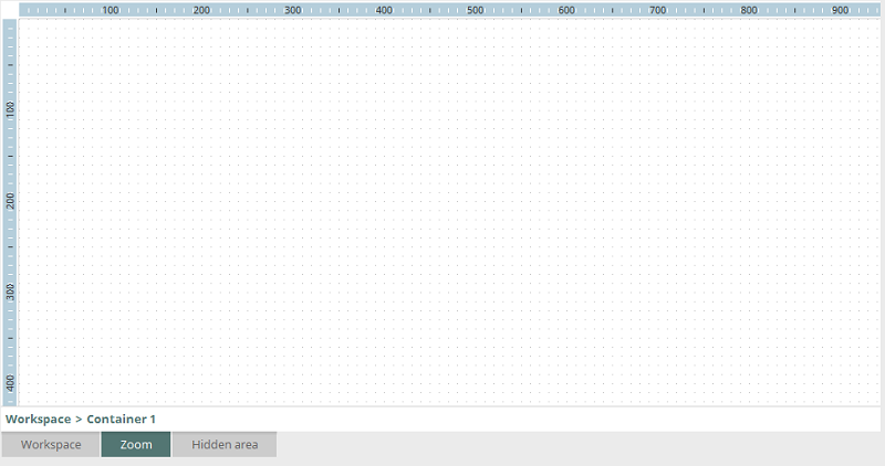
When the element is inserted, there are already two containers (Container 1, Container 2) in the grid. Double-clicking on one of the containers opens the Zoom area. This is an individual workspace for each container, you can insert the elements that you'd like to see in the currently selected container.
A preview of the containers with their elements is shown on the workspace.
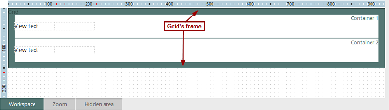
Even if this view, the properties dialog of the elements can be reached by double-clicking on the element, e.g. an Edit field here. New elements can also be inserted. The grid's properties dialog can be opened by double-clicking on the its frame.
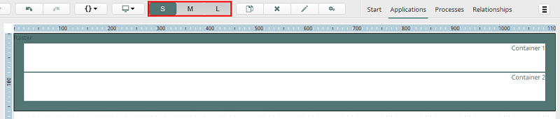
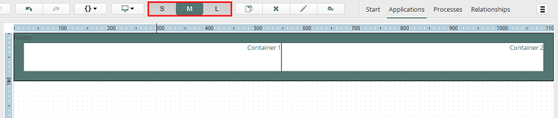
In the toolbar you'll find the buttons S, M and L, marked in red here. These allow you to switch between the previews for the various display sizes. The Grid element on the workspace will then be displayed with the corresponding preview.
Display size S
All settings which are defined for the display size S (SMALL, e.g. for smartphones) apply to the display sizes M (MEDIUM, e.g. for tablets) and L (LARGE, e.g. for desktop PCs), provided no settings have been specified for these display sizes. The settings for the display size S will be inherited by the display sizes M and L.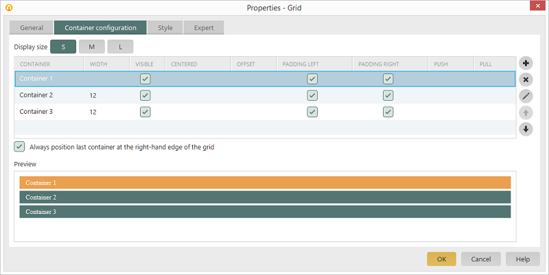
Here, three containers are defined on the Container tab in the grid's properties dialog. With the Width you can specify how many units of the 12 units, which a grid provides per row, should be taken up. You can select from a width between 1 and 12. Here, a width isn't specified for Container 1, this means that the container automatically takes up all 12 units of the grid. You can alsways see the current distribution within the grid in the preview at the bottom of the dialog.
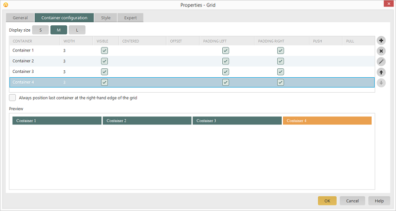
Display size M
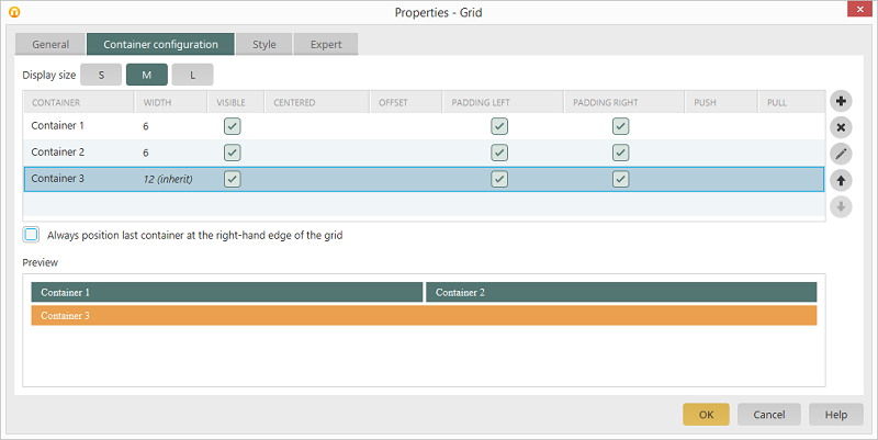
The first two containers are given a width of 6 for the Display size M here. Each container therefore, as shown in the preview, takes up half of the grid. Container 3 inherits the width from the display size S, because a different width has been entered.
Display size L
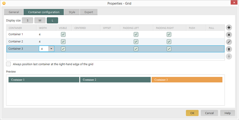
All three containers are given a width of 4 for the Display size L. Each container therefore takes up a third of the grid.
General settings of grids
All information regarding this topic can be found here.Container settings
All information regarding this topic can be found here.FAQ
Why does a grid have 12 units?
Twelve units are widely used in the area of web design and provide the greatest flexibility for designing pages.What is the difference between mobile a responsive pages?
Responsive pages aren't a replacement for mobile pages. Which structure is best depends on the current scenario of application. Here are the advantages and disadvantages of mobile and responsive pages:| Mobile page | Responsive page | ||
| + | Reduced data volume because fewer CCS and JavaScript files are transferred | - | Hidden containers are also transferred |
| - | Separate pages must be created for desktop PCs and mobile devices | + | View and edit pages only need to be created once |
| + | Automatically adapts to the display size | ||
| + | Well suited for poor mobile data connections, e.g. without WLAN | + | Well suited when all clients have good mobile data connections, e.g. WLAN |
| - | Modifications must be carried out on multiple pages | + | Reduced maintenance requirement |
| - | Increased complexity in the conception as the page needs to be designed for three display sizes | ||
| + | Design and content can be adjusted optimally to display size | ||
| + | Parallel to an existing desktop version is feasible at any time | ||
Why is the last container in the grid always positioned to the far right and how can I change that?
This behavior is due to its adaption to various browsers. If the last container in the rastr should be positioned directly after its predecessor, you can deactivate the Always position last container at the right-hand edge in the Container settings dialog. If paddings aren't removed or the same column height isn't created, then the last container will be positioned directly after its predecessor.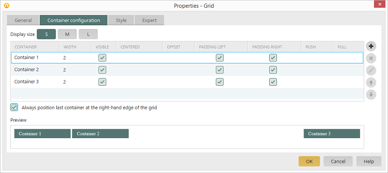
In the preview at the bottom of the dialog you can see three containers, each one is two grid units and uniformly arranged in the grid when the Always position last container at the right-hand edge setting is activated.
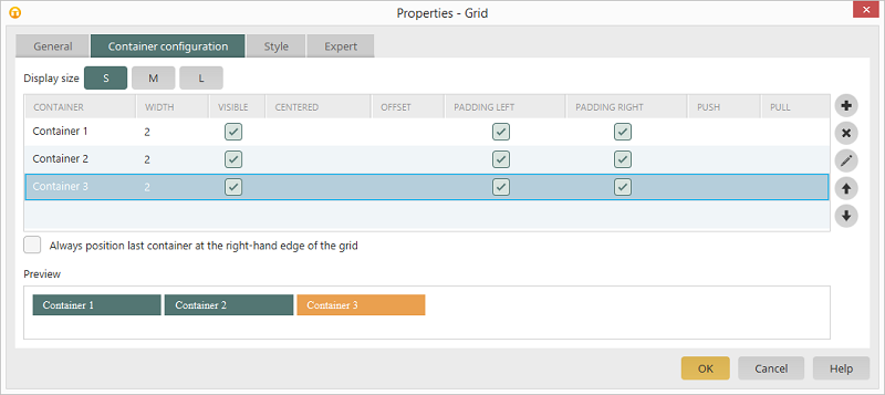
Here is the arrangement when the Always position last container at the right-hand edge setting is deactivated.
How can I center a container on a page and what effects does that have?
All information regarding this topic can be found here.How are distances between containers defined and what effect does the Offset setting have?
Using the Offset setting, a container and all of successive containers can be moved to the right by a defined number of grid units.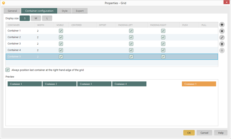
Here you can see five containers, each one is two grid units wide.
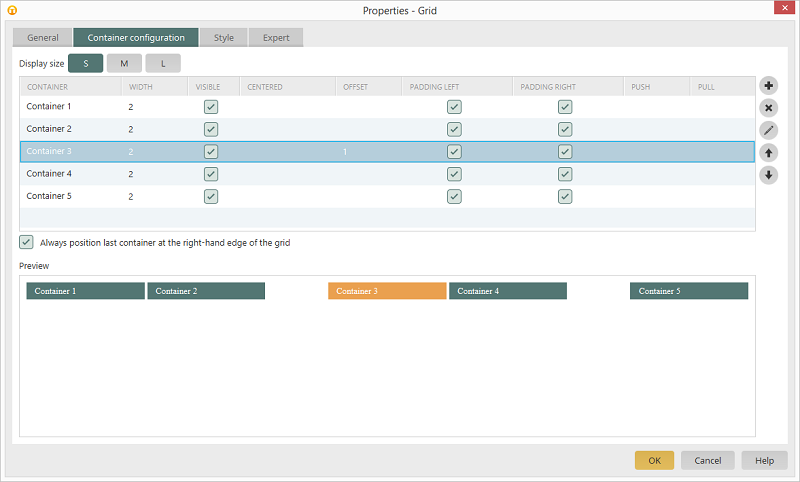
Here is the same container arrangement, each one is two grid units wide. An offset of three grid units has been specified for Container 3.
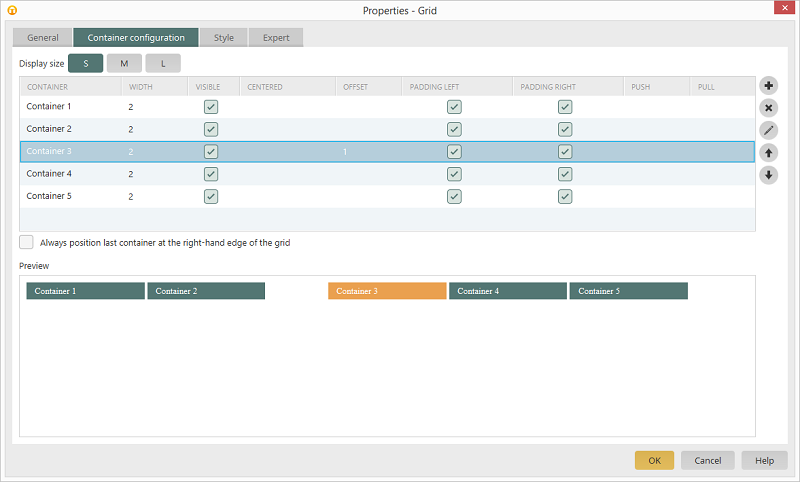
The same container arrangement, each one is two grid units wide. An offset of three grid units has been specified for Container 3. The Always position last container at the right-hand edge setting has been deactivated.
Why can't I see any containers which I have hidden for the display size SMALL on my desktop PC?
Settings, such as visibility, which have been defined for the display size SMALL also apply to the display sizes MEDIUM and LARGE, provided that individual settings for these display sizes haven't been carried out.Why does a tooltip need a fixed width if it's opened from within a container?
If a tooltip is opened from within a container, then its crucial that this has a fixed width because the tooltip would otherwise be as wide as the container from which the tooltip was loaded. If, for example, a container stretches across one grid unit, then the tooltip is only as big as the calculated percental width of the grid unit. A tooltip's width can be fixed by opening the properties dialog of the button that loads the tooltip. On the Actions tab you'll find the Destination options. Click on Configure tooltip positioning there.
How can individual containers be rearranged for various display sizes?
The properties Push or Pull can be assigned to the containers. These settings make it possible to move a container to the right or left, respectively, by a certain number of grid units. As opposed to the Offset option, the successive containers won't be moved. The Push and Pull properties are usually used to swap containers of the same size. To do this, one container is given the Push property - move to the right - and the second container is given the Pull property - move to the left. |
If unsuitable values are entered for Push and/or Pull, then the containers will overlap, this generally leads to undesirable results. |
You can see four containers, each one is three grid units wide, in the display size MEDIUM. Container 1 and 4 should swap their positions for the display size LARGE.
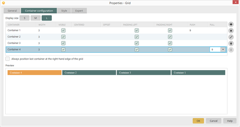
To do that, Container 1 is given the Push property with a value of 9. Container 4 is given the Pull property with a value of 9.