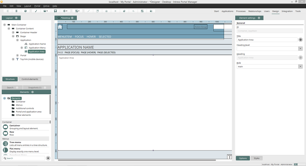
Areas of the Design module
Layout propertiesLayout
Elements
Snapshots
Search
Workspace
Element settings
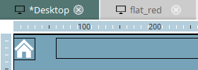
If you have more than one layout open, you can use the tabs at the top of the workspace to switch between them. The size of each area can be adjusted by dragging with the mouse. To do that, position the mouse at the edge of an area until the mouse pointer changes to a double-headed arrow. If there isn't enough space in an area to display all of the elements, horizontal and/or vertical scroll bars will appear.
Any tab in the module can be closed by clicking on the
 symbol next to the title.
In the menu View, you can select which tabs should be displayed or hidden.
If a tab is shown in its own window, you can also anchor it to the right or left of the workspace by dragging the title to the desired position with the mouse.
symbol next to the title.
In the menu View, you can select which tabs should be displayed or hidden.
If a tab is shown in its own window, you can also anchor it to the right or left of the workspace by dragging the title to the desired position with the mouse.
While the window is being moved, the area will be shaded in gray as a preview in its future position and then anchored when you release the mouse button. Anchored areas can also be moved in this way to other positions.
Layout properties
By double-clicking on the tab at the top of the workspace, the properties dialog of that layout will be opened.
Layout
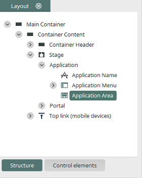
In the area Layout, your layout's structure is depicted. You can find out about the hierarchies of the different elements here.
Structure
When you select an element in the structure, it will be highlighted on the workspace. Its settings will be shown in the Element settings area and can be changed there. Layout elements can be moved via drag & drop in the layout tree if their arrangement needs to be changed.Control elements
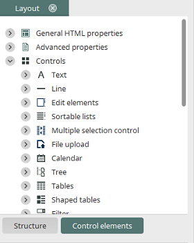
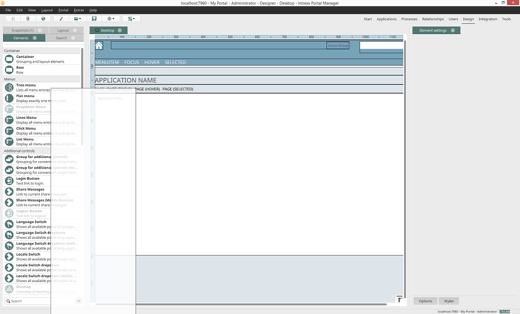
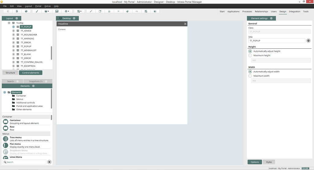
Clicking on Control elements switches to a view in which you can load, and then edit, the settings for General HTML properties (such as body, table, or div), Advanced properties (such as login, warnings, error messages), and Controls (such as edit fields or buttons) in the Element settings area. The control elements that you find here can be assigned in the Applications module to application elements. The control elements are ordered by type in the Design module, e.g. edit elements or buttons. For tooltips, the maximum height and width can be controlled in the element settings by selecting this control element in the Layout area.
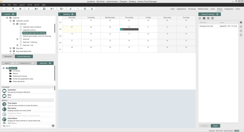
For the Calendar control element, the corresponding style properties are shown in the Element settings as soon as you select a specific area (e.g. a calendar cell or an appointment title) in the preview.
Elements
You will find the area Elements underneath the area Layout. The elements that you will use to construct a layout can be selected here and then moved onto the workspace via drag & drop.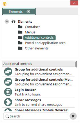
How the elements are displayed can be changed via the context menu.
- Show Icons displays the elements' icons
- Show Icons and Titles displays the elements' icons and titles
- Show Icons and Descriptions displays the elements' icons and descriptions
Snapshots
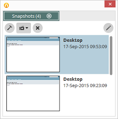
With snapshots, the current layout is "photocopied" at specific intervals. Click on one of the snapshots to reset the layout to the state at that time. Clicking on
 Create new snapshot will create a photocopy of the layout at this point in time. A snapshot can also be generated with comments from the context menu.
 Open selected snapshot will load the highlighted snapshot. Delete selected snapshot will remove the selected snapshot. Clicking on
  Options will open a dialog which allows you to specifiy the maximum number of created snapshots and the interval for automatically generating snapshots.
Search
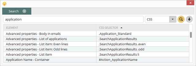
Here, you can search for the title of an element, a CSS selector or for properties in the CSS by selecting CSS. All elements, for which the entered search term applies, will be listed after clicking on Search. Double-clicking on a hit highlights the searched-for element in the workspace.
Workspace
You can arrange the individual elements of your layout in the workspace, which you'll see in the middle area.Element settings
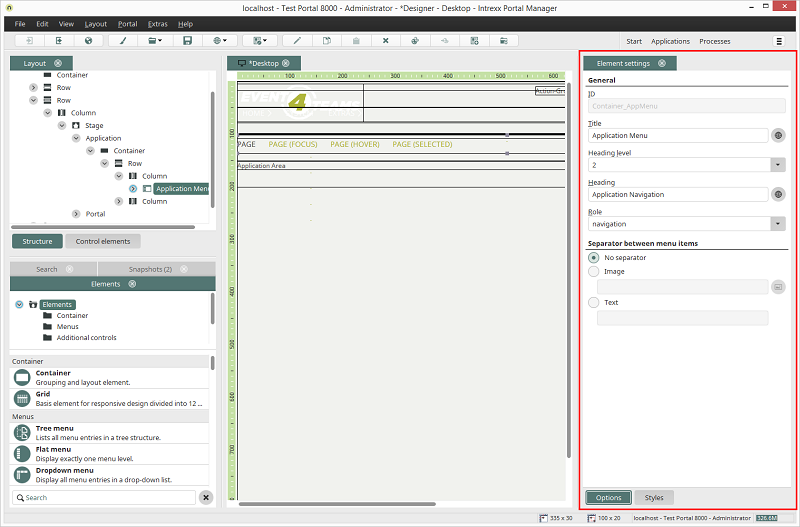
At the bottom of the element settings, there are two buttons Options and Styles. These can be used to switch between the two edit modes for the settings. In the Options,the element settings that are more functional can be edited. In Styles, the style properties can edited.
A description for the element settings in the Options tab can be found here.
A description for the element settings in the Styles tab can be found here.