Button properties - Actions tab - Link destination and Destination options
Applications module
Button
Properties / Actions tab
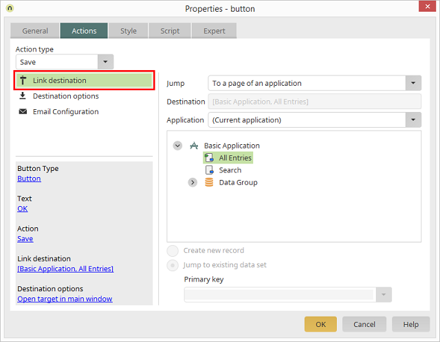
Link destination
In the Link destination, you can define whether and which page should be
opened when a user clicks on the button.
Jump
In the drop-down list on the right of the dialog, you can select that the
button should jump
To a page of an application, if
the action type
Save or
Delete has been chosen. If the action type
No action is selected, the following options are available:
-
No jump
This setting can, for example be used, if a button performs a
JavaScript but should not
perform another action or load a page.
-
Back
Jumps back to the previously loaded page.
-
To a page of an application
Loads the corresponding page.
-
To URL
Jumps to the URL specified in the Destination
field below the drop-down list.
-
To the start page of the portal
Loads the portal's start page.
-
Plugin page
If the link destination is selected from a
Calendar element, you can load the page where the
Calendar plugin is defined.
Destination
The page that should be loaded is automatically entered into this field
when you click on it in the application structure depicted beneath.
Application
Here, select the application that contains the target page.
Create new record
This setting can be activated for pages that perform a jump to edit pages.
In this case, the edit page will be loaded with empty fields and without
data so that the user can create a new data record.
Jump to existing data set
In a similar way, the option
Jump to existing data set
can open an existing data record for editing.
Primary key
Here, a data field from the currently selected data group can be specified. Its
value will be compared to the
Primary key
of the target data group. If the values match, the corresponding record from the target
data group will be loaded on the target page.
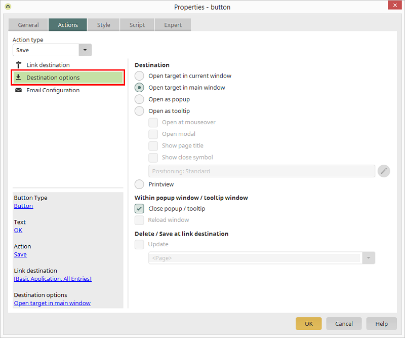
Destination options
Open target in current window
Opens the target page in the currently opened window.
Open target in main window
Opens the target page in the main window.
Open as popup
Opens the target page as a popup.
Open as tooltip
Opens the target page as a tooltip. Additionally, the
Open at mouseover setting can be activated here, this means that the
target page will be shown as a tooltip as soon as the user moves the mouse
over the link/button.
Open modal
With this setting the tooltip can no
longer be left via the
Close popup / tooltip link
or via the close symbol in the upper right-hand corner. A modally
opened tooltip can only be left and closed via buttons that you have
configured accordingly.
 |
A tooltip can only be opened modally if it is not opened at
mouseover or relatively positioned to another element. In this case,
the Open modal setting is not active. A
small help button will be shown next to the checkbox which will
explain why the tooltip currently cannot be opened modally; this
will appear as a tooltip if the user moves the mouse over the help button.
|
Show page title
This setting has the effect that the title of
the page in the browser will be shown in the title bar of the tooltip.
With
Show close symbol, a symbol will be shown in
the upper right-hand corner of the tooltip, allowing the tooltip to be
closed.
Configure tooltip positioning
Clicking on
 Configure tooltip positioning
 opens a dialog which allows you to define
how and where the tooltip is displayed on the page.
Print view
With this setting, the target
page will be displayed in a format for printing. For this, the target
page must be loaded in a popup window. The
Print view setting
has no effect for pages in the main window. In the print view of a
page, all buttons will be hidden. At the foot of the page, the
Print
button will be automatically displayed, which will open the system
dialog for printer selection.
|
In order to print shadows and borders, please activate
the Print
background colors and images option in Internet Options /
Advanced in your browser. The printing of headers and
footnotes can be controlled via the browser menu item File /
Page Setup.
|
Within popup window/ tooltip window
Intrexx Application pages can be loaded in popup windows or shown as
tooltips. By clicking a button with the
Close
popup / tooltip setting, a popup window will be closed, and a tooltip
will be hidden. The target page can be reloaded with the
Reload
window setting.
Delete / Save at link destination
If the target page is opened in a popup or a tooltip, you may define
here the area of the page, from which the target page will be loaded,
will be refreshed. After the
save /
delete
action is completed, the entire page (or just the table) can be
refreshed. If the button is located within a
free layout table
the free layout table can be reloaded as well. In that case, select
<
Current free layout table> (in angle
brackets) from the
update following areas list.