Design module - Element settings - Options
Design module Areas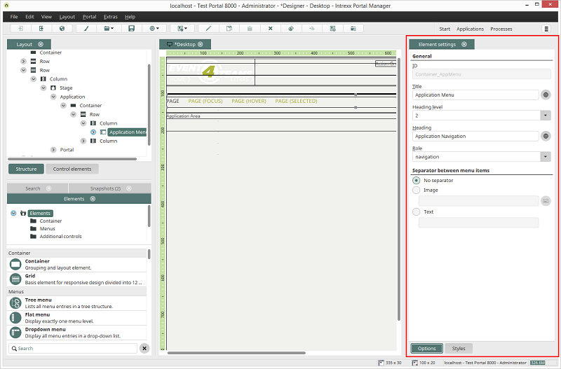
If a layout element is selected on the Workspace or in the Structure, its properties will be shown in the Element settings area. At the bottom of the Element settings, you'll find the buttons Options and Styles. Click on Options to edit the optional properties of the currently selected element.
General
ID
For every element, you'll find the ID, which is used to identify the element in CSS, in the general section of the options. If the ID is editable here, you need to make sure that you use an ID that is unique in this layout. If you use an ID twice, your changes will be dismissed as soon as you click on another element in the workspace.Title
You can provide your element with a title here as well that will be used in all areas of the Design module.Heading / Heading level
You can assign a heading level and a heading. The heading level has no impact on the hierarchy in the layout but will be written, as well as the heading, under the container in the HTML. This means that the heading can be used and read by screen readers and search engines.Role
If you would like to construct accessible pages or would simply like to bring more transparency to your layout structure, you can assign a Role to the element.Other languages
Whenever you see the symbol Other languages, you can click here to add
multilingual text. Any other settings, which can be applied in the area
Options, vary from element to element.
Other languages, you can click here to add
multilingual text. Any other settings, which can be applied in the area
Options, vary from element to element.
Tooltips
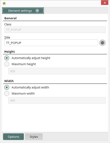
If a tooltip is selected in the Control elements area, the following options are shown.
Automatically adjust height/width
The size will be automatically adjust in relation to the rest of the pageMaximum height / width
Here, you have the ability to enter a maximum height or width respectively.Application menu
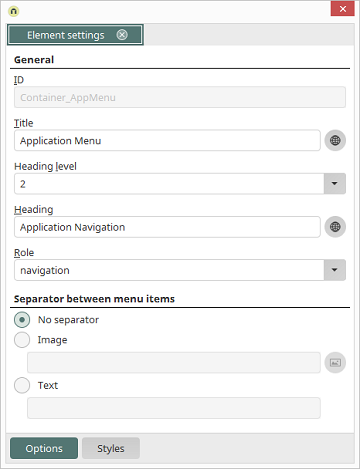
If the application menu is selected on the Workspace, the following options are shown.
No separator
With this option, a separator will not be shown between the application menu points.Image
Here, an image can be inserted as a separator between the application menu points. The image can be selected by clicking on Select image.